
Primary colors in design are more than just basic shades—they are the foundation of every color you see on a website, logo, app, or advertisement. Whether you are designing a brand identity, a website UI, or marketing creatives, understanding primary colors directly impacts visual appeal, user experience, and brand perception.
Designers who master primary colors can control emotions, guide attention, and build trust effortlessly. From Google’s blue to Coca-Cola’s red, powerful brands rely on color psychology rooted in primary colors.
In this guide, you’ll learn what primary colors are, why they matter, how they work in digital and print design, and how to use them strategically to create visually appealing and effective designs.
Table of Contents
What Are Primary Colors?
Primary colors are colors that cannot be created by mixing other colors. They serve as the base from which all other colors are formed.
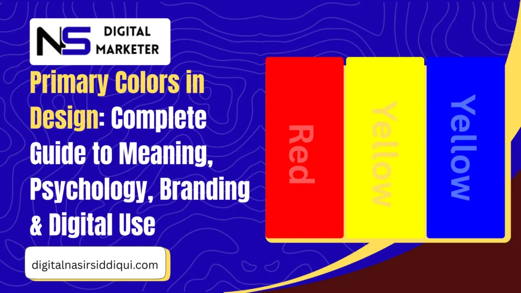
In traditional color theory, the three primary colors are:
- Red
- Yellow
- Blue
By mixing these colors, designers create:
- Secondary colors: Orange, Green, Purple
- Tertiary colors: Variations created by mixing primary and secondary colors
Together, these combinations form the color wheel, a fundamental tool in design and art.
The Three Primary Colors Explained
1. Red – Energy, Passion & Urgency

Symbolism & Meaning
- Passion, love, excitement
- Power, urgency, strength
- Attention and alertness
Psychology of Red
Red increases heart rate and stimulates appetite, which is why it’s heavily used in food and retail branding. It creates urgency and draws immediate attention.
Use in Branding
- Common in fast food, sales, and entertainment brands
- Effective for call-to-action buttons
Brand Examples
- Coca-Cola
- Netflix
- YouTube
Hex Code: #FF0000
2. Yellow – Optimism, Warmth & Creativity

Symbolism & Meaning
- Happiness, positivity, warmth
- Energy and friendliness
- Caution and alertness (traffic signs)
Psychology of Yellow
Yellow boosts creativity and mental clarity but should be used carefully—overuse can cause visual fatigue.
Use in Branding
- Ideal for friendly, budget-friendly, or youthful brands
- Often used as an accent color
Brand Examples
- McDonald’s
- IKEA
- Snapchat
Hex Code: #FFFF00
3. Blue – Trust, Calm & Professionalism
Symbolism & Meaning
- Trust, reliability, calmness
- Intelligence and security
- Professionalism
Psychology of Blue
Blue has a calming effect and builds trust, making it ideal for corporate, tech, finance, and healthcare industries.
Use in Branding
- Popular in corporate logos and digital platforms
- Enhances credibility and user confidence
Brand Examples
- IBM
- PayPal
Hex Code: #0000FF
A Brief History of Color Theory
Color theory has evolved over centuries:
- Ancient era: Aristotle believed color came from light and darkness
- 17th century: Isaac Newton discovered that white light contains all colors and introduced the color wheel
- 19th century: Goethe explored emotional responses to color
- 20th century: Munsell system classified color by hue, value, and chroma
Today, modern color theory blends science, psychology, and design, guiding everything from branding to UI/UX.
How Humans Perceive Color
The human eye detects color using cone photoreceptors:
- S cones: Short wavelengths (blue)
- M cones: Medium wavelengths (green)
- L cones: Long wavelengths (red)
The brain processes signals from these cones to create color perception. This is known as trichromatic vision, explained by the Young–Helmholtz theory.
This biological system is why primary colors play such a critical role in how we experience design visually.
Primary Colors & Color Models Explained
RGB Color Model (Digital Design)
- Used for screens (websites, apps, TVs)
- Colors created by mixing Red, Green, Blue
- Additive model: more light = brighter colors
- White = all colors at full intensity
- Black = absence of light
Used in:
- Web design
- UI/UX
- Digital ads
- Social media creatives
CMYK Color Model (Print Design)
- Used for printing
- Colors: Cyan, Magenta, Yellow, Black
- Subtractive model: ink absorbs light
- Black ink (K) added for accuracy
Used in:
- Business cards
- Brochures
- Posters
- Packaging
Other Important Color Models
| Model | Use Case |
|---|---|
| HSL / HSV | User-friendly color adjustments |
| Pantone | Print color consistency |
| CIELAB | Device-independent color accuracy |
At Digital Nasir Siddiqui, design is approached with a perfect balance of creativity, strategy, and user psychology. By deeply understanding how primary colors influence emotions, brand perception, and user behavior, Digital Nasir Siddiqui helps businesses create visually powerful websites, logos, and digital assets that truly connect with their audience.
Every color choice is intentional—whether it’s building trust through calming blues, driving action with energetic reds, or creating positivity with warm yellows—ensuring that each design not only looks appealing but also supports business goals, brand consistency, and long-term digital growth.
How Digital Design Uses Primary Colors
In digital design, RGB primary colors control every pixel on the screen.
Applications
- Web Design: Hex codes ensure color consistency
- Graphic Design: Layer-based RGB editing
- UI Design: Visual hierarchy and usability
Example
- Red for error messages
- Blue for links and trust elements
- Yellow for highlights or alerts
How to Maintain Color Consistency in Digital Design
Follow these best practices:
- Choose a primary brand color
- Use RGB or Hex values consistently
- Avoid excessive saturation
- Test designs across devices
- Use design systems or style guides
Tip: Always check contrast for accessibility and readability.
Why Primary Colors Are Important in Design
1. Foundation of All Colors
Every color originates from primary colors.
2. Strong Brand Identity
Consistent use builds recognition and recall.
3. Better User Experience
Colors guide navigation and actions.
4. Visual Harmony
Balanced color combinations improve aesthetics.
5. Emotional Influence
Colors shape user emotions and decisions.
6. Cross-Platform Consistency
Ensures uniform branding everywhere.
Practical Checklist for Designers
- Choose one dominant primary color
- Use secondary colors for balance
- Maintain contrast ratios
- Stick to brand guidelines
- Test on multiple screens
As a professional Web Developer, every design and development decision goes beyond aesthetics to focus on usability, performance, and user experience. A skilled Web Developer understands how elements like primary colors, layout structure, and visual hierarchy work together to guide user behavior, improve readability, and strengthen brand identity.
By combining clean code with thoughtful design principles, a Web Developer ensures that websites are not only visually engaging but also fast, responsive, and optimized for conversions across all devices.
Conclusion: Key Takeaways
Primary colors in design are not just theory—they are powerful tools that influence emotions, usability, and brand perception. Red creates urgency, yellow spreads optimism, and blue builds trust. When used strategically, these colors enhance visual harmony and user experience across digital and print platforms.
Mastering primary colors allows designers to create memorable, effective, and emotionally engaging designs that truly connect with users.
Frequently Asked Questions
Can primary colors influence emotions in design?
Yes. Red triggers urgency, blue builds trust, and yellow promotes positivity.
How do primary colors affect brand recognition?
Consistent primary colors help users instantly recognize a brand.
How can I ensure color consistency across devices?
Use RGB hex codes, color profiles, and test designs on multiple screens.
Are primary colors important in website design?
Absolutely. They guide attention, improve navigation, and enhance UX.
Can primary colors be combined with other elements?
Yes. Pair them with typography, imagery, and neutral tones for balance.